.jpg)
A Closer Look at Who I Am
I come from an IT background, but my interest shifted towards how users interact with products rather than just how they function.
My design process starts with breaking down the problem — understanding the flow, removing friction, and simplifying decisions for the user.
I focus on structure before styling, ensuring hierarchy, spacing, and interactions guide the user naturally.I believe design is not about adding more, but about removing what’s unnecessary until only clarity remains.
I’m currently building my skills further and working on projects that help me grow as a designer. I'm looking forward to opportunities where I can contribute to real-world design challenges and learn from experienced teams.
Let's Connect
Labsy – At-Home Blood Test App
At-home blood test booking, designed for elderly users.
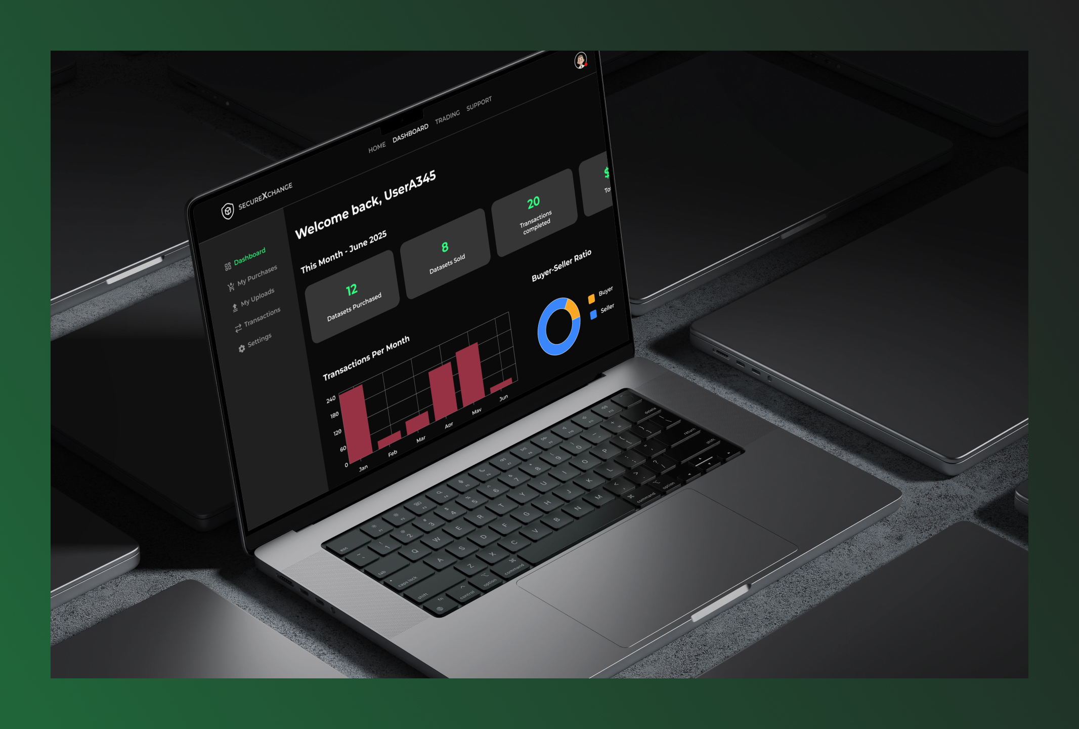
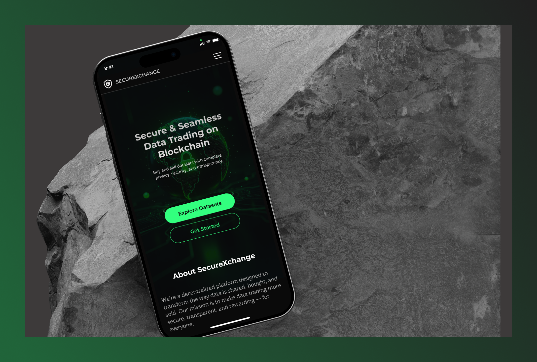
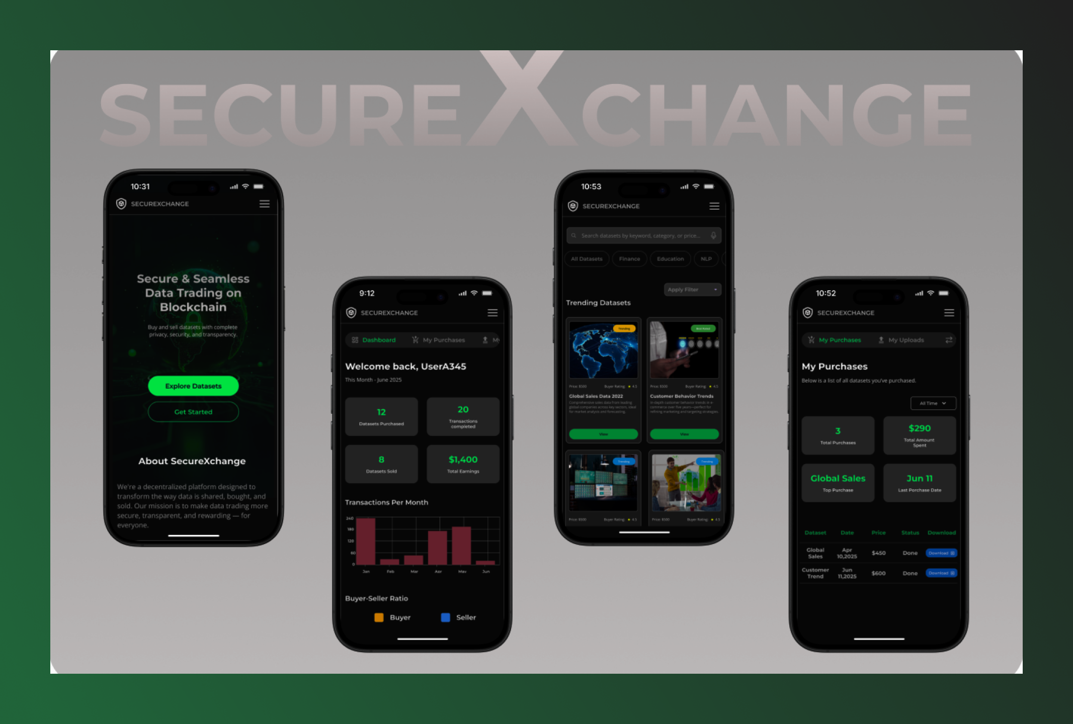
SecureXchange
SecureXchange is a blockchain-powered platform that enables secure, transparent, and anonymous trading of valuable datasets.
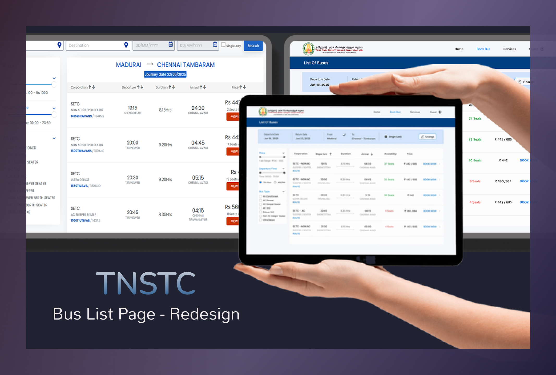
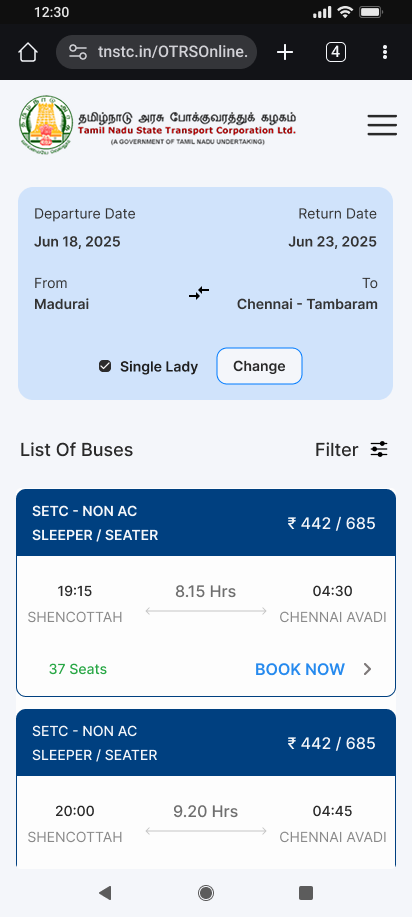
TNSTC Bus Booking UI Redesign
A UX redesign of the TNSTC Bus List Page focused on making bus selection faster, clearer, and more user-friendly across mobile and desktop.
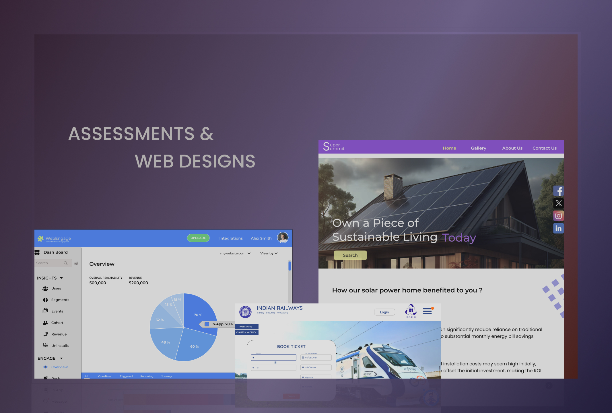
WebDesigns and Assessment Tasks
This is my assessment work during the hiring process and webdesigns, showcasing my problem-solving skills and creativity through my designs, hoping you enjoy it.
Roam Easy - your social travel companion
A mobile app designed to simplify travel planning by connecting travelers with companions, guides, and destination insights for seamless journeys.
.jpg)
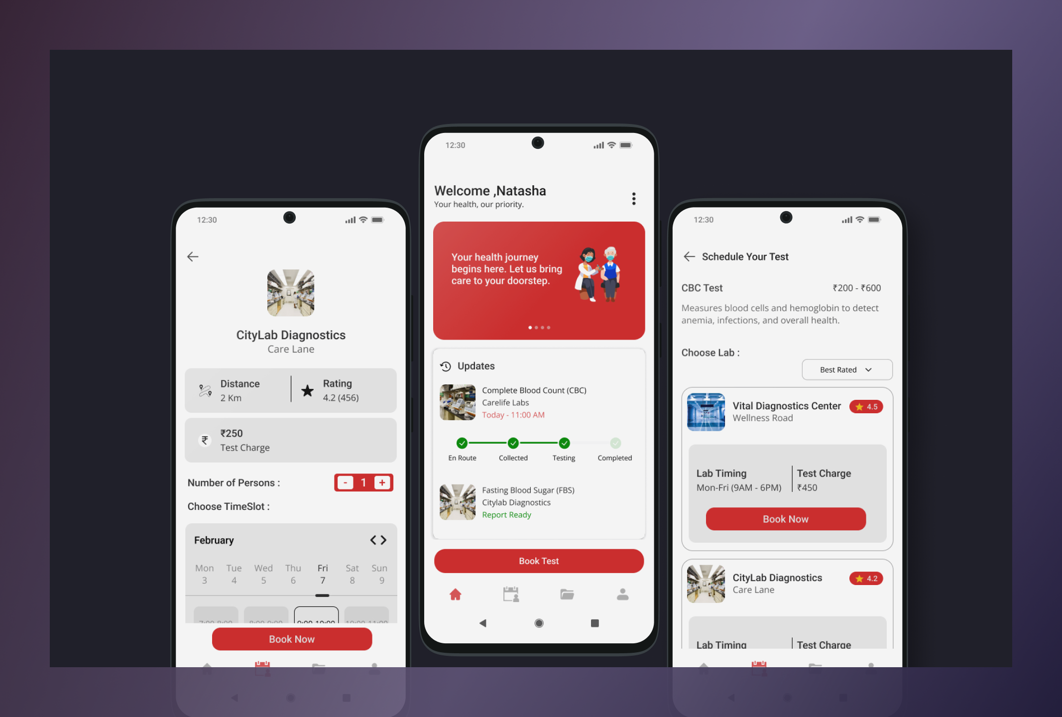
Labsy – At-Home Blood Test App
A mobile app that simplifies at-home blood test booking for elderly users, enabling lab comparison and doorstep sample collection.
Role: UX/UI Designer (Solo Project)
Platform: Mobile App (Android)
Tools: Figma
Elderly users struggle to visit labs — mobility issues, long queues, and confusing booking processes delay basic healthcare.
Labsy is a mobile app that brings the lab to the user's doorstep. Instead of travelling, waiting, and guessing costs — users can:
→ Browse and select the right test without medical jargon
→ Compare nearby labs by distance, price, and rating
→ Book a home sample collection in under 3 minutes
→ Receive digital reports directly on the app
Started with lo-fi wireframes to nail the flow → refined into a clean, accessible UI with large text, clear icons, and calm colors.
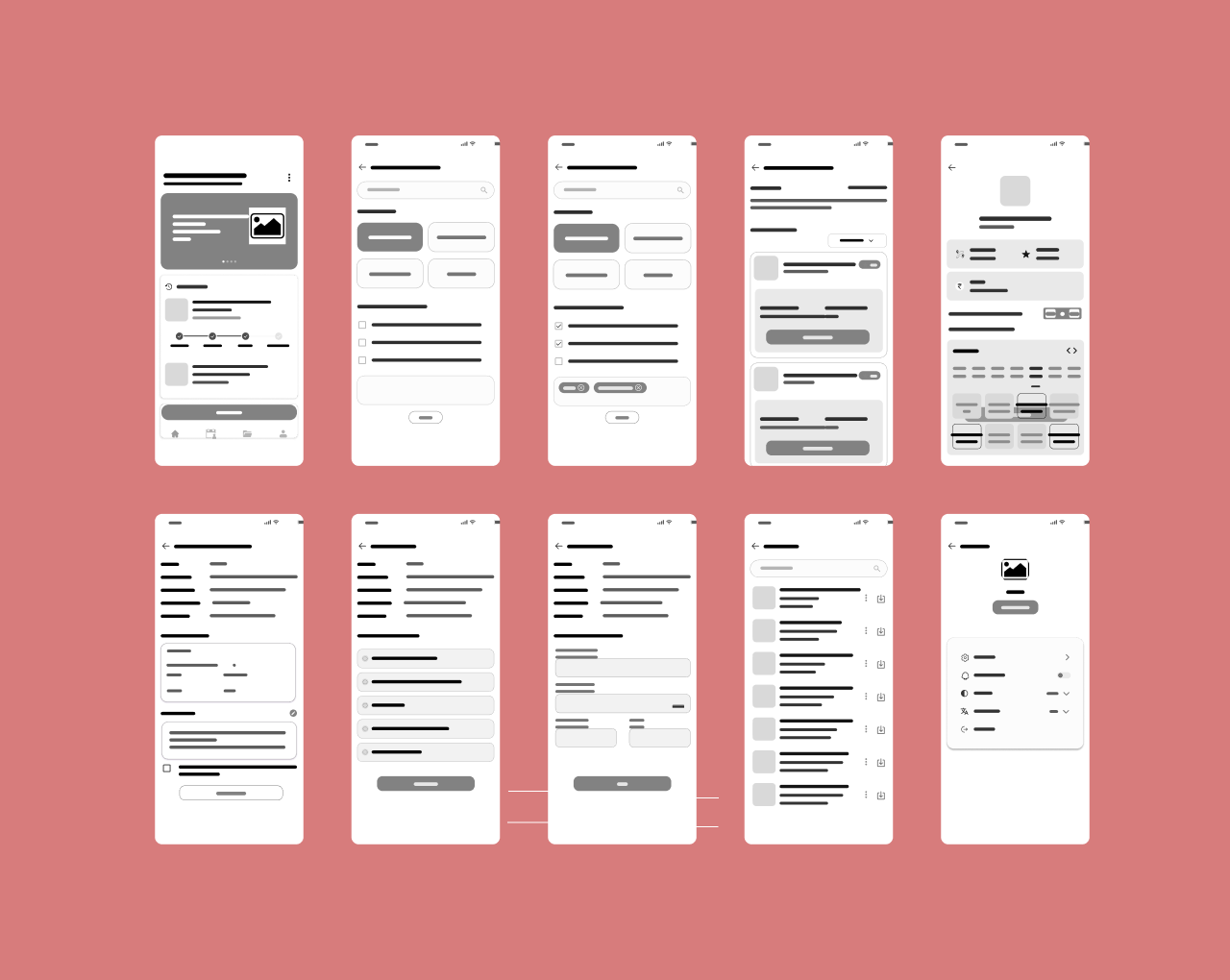
Low-Fidelity Wireframe
This low-fidelity wireframe captures the basic structure and layout of the app, focusing on functionality over aesthetics. It helps in refining the user flow.
UI Design
Here’s the transition from wireframe to UI design. This visual brings the app to life with color and elements, aiming to create a delightful user experience.
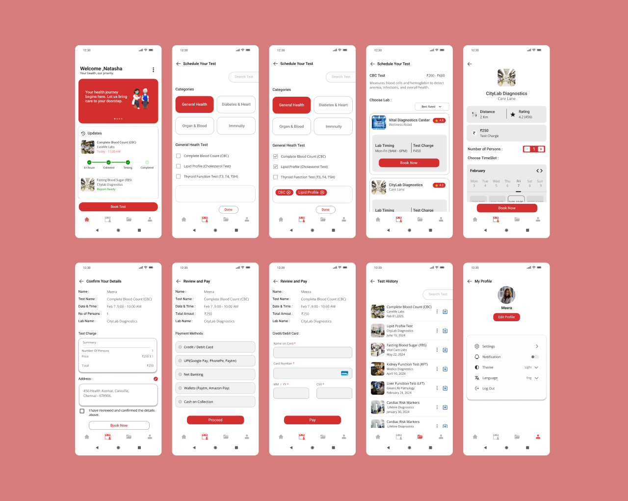
Test Selection
• Large text and clear icons for easy browsing
• No medical jargon — simple, everyday language
• Designed to reduce confusion during test selection
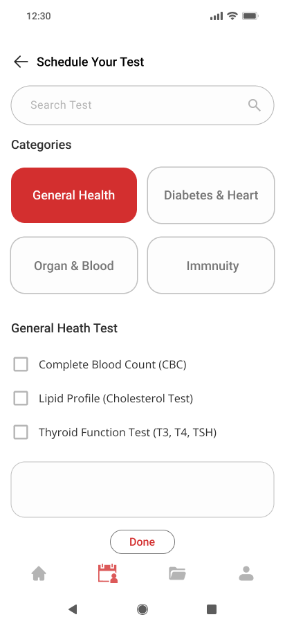
Lab Selection
• Filter by distance, price, and rating in one tap
• Ratings help elderly users choose labs confidently
• Clean layout reduces decision fatigue
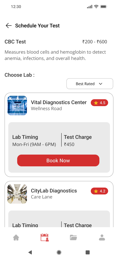
Booking Process
• Single screen booking — select time, confirm, done
• Automatic reminders reduce dependency on family
• Minimal steps to avoid overwhelming elderly users
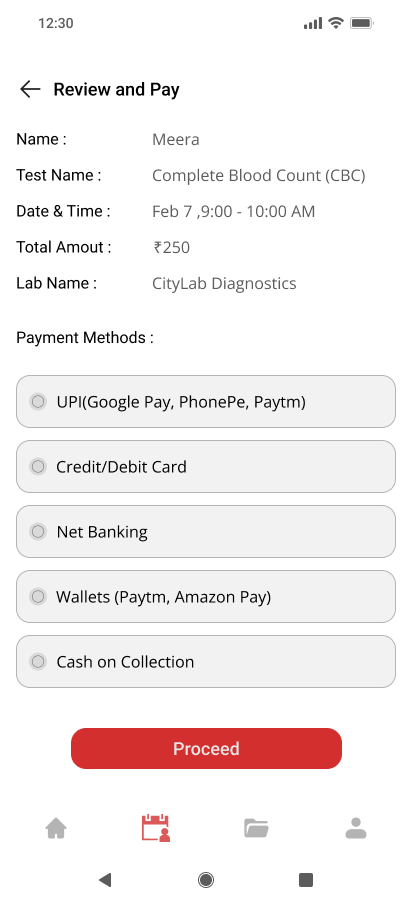
Transparent Pricing
• Full cost shown before booking confirmation
• No hidden fees — builds trust for first-time online users
• Reduces drop-off at the payment stage
Anantha prepares for her upcoming routine health check, she’s relieved knowing she no longer has to visit a crowded lab or rely on phone calls for appointments. With Labsy, everything she needs is right at her fingertips.
Task: Imagine you're Anantha, preparing for a regular health check from home.
Your task is to:
Open the Labsy app and search for the required blood test.Compare labs based on proximity, pricing, and user ratings.Choose a preferred lab that offers home sample collection.Schedule a convenient time for collection.Receive your test report digitally through the app.
Designing Labsy reinforced that the best healthcare experiences are invisible — users shouldn't have to think, they should just be able to act. Keeping the flow simple and the language human made all the difference.
• 2 informal testers completed the full booking flow without any guidance
• 0 confusion points observed during testing the flow felt natural
• Full booking in 4 screens kept intentionally short for elderly users
• Next step - formal usability testing with more elderly users to uncover deeper friction points
TNSTC Bus Booking UI Redesign
I redesigned the bus list page for both mobile and desktop, focusing on clear information hierarchy, scannable layouts, and faster decision-making.
Role: UX/UI Designer (Solo Project)
Platform: Web & Mobile Responsive
Tools: Figma
TNSTC's bus list page was cluttered and hard to scan—users struggled to compare options and make quick booking decisions.
Time Format Confusion
Users struggle to quickly understand departure and arrival times due to the 24-hour format.
Poor Seat Visibility
Seat availability is not clearly highlighted, making it hard for users to assess options at a glance.
Cluttered Mobile Experience
The mobile layout feels cramped, reducing readability and increasing cognitive load.
Weak Information Hierarchy
Important details like price, timing, and duration lack clear visual priority, slowing decision-making.
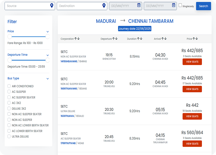
Web – Original
The original web layout feels cluttered with too many equally weighted columns, making it hard for users to quickly scan and compare options. Important details like price and seat availability don’t stand out, and the filter panel takes unnecessary visual attention..
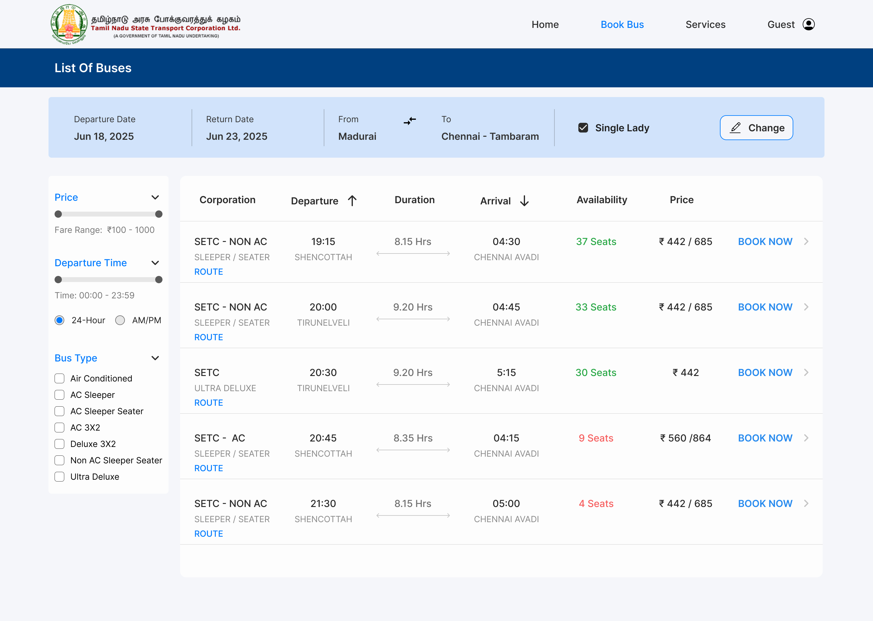
Web – Redesigned
The redesigned version improves clarity with better spacing, alignment, and a stronger visual hierarchy, making key information easier to scan. Clearer CTAs and subtle color usage help users focus and take action faster.
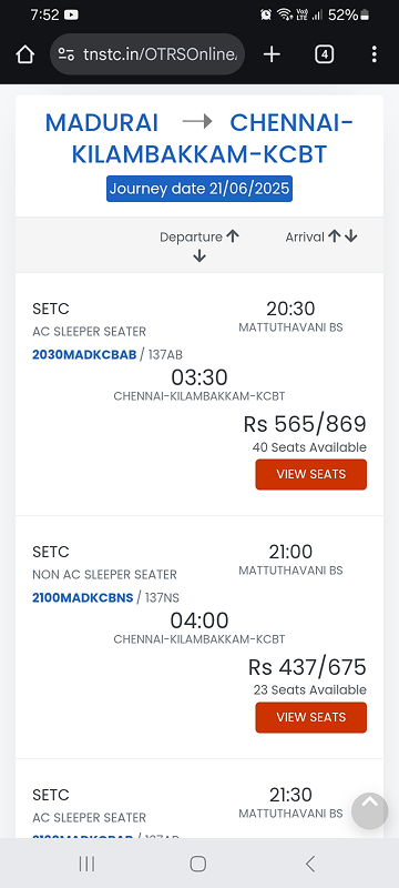
Mobile – Original
The mobile layout feels cramped, with poor grouping of information, making it difficult for users to process timings, price, and availability quickly. Seat visibility is low, and similar-looking cards make comparison harder.
Mobile – Redesigned
The redesigned mobile version uses clean card layouts and better grouping, improving readability and quick comparison. Seat availability and CTAs are more prominent, making the booking decision smoother.
→ Hierarchy Matters
Even small typography and spacing changes drastically improve scannability.
→ Mobile Constraints
Drive Better Design Designing for small screens forced me to prioritize ruthlessly, which also improved the desktop version.
→ Real-World Redesigns Are Harder
Unlike starting from scratch, redesigns require understanding legacy constraints while still pushing for meaningful improvements.
Preference Test Results (n=3):
→ 100% preferred the redesigned layout
→ Average decision time: 2 minutes
→ Key feedback: "Cleaner," "Easier to compare," "Less cluttered"
This early signal confirmed I was on the right track, though a larger sample would be needed to draw firm conclusions.
SecureXchange
A blockchain-powered platform for secure, transparent data trading with smart contracts and role-based dashboards.
Role: UX/UI Designer (Solo Project)
Platform: Web Dashboard (SaaS)
Tools: Figma
Data trading is often centralized, risky, and lacks transparency — making it hard for individuals and organizations to securely buy or sell datasets.
A secure platform where sellers list datasets, buyers browse with trust, and blockchain smart contracts handle transactions.
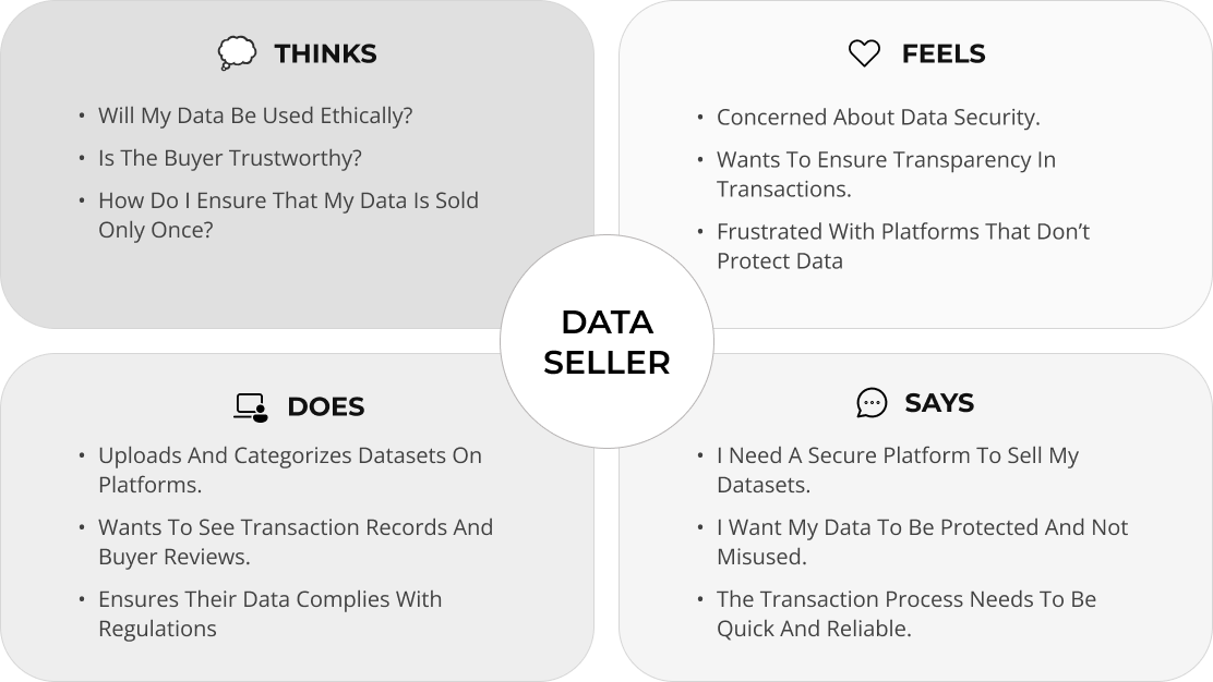
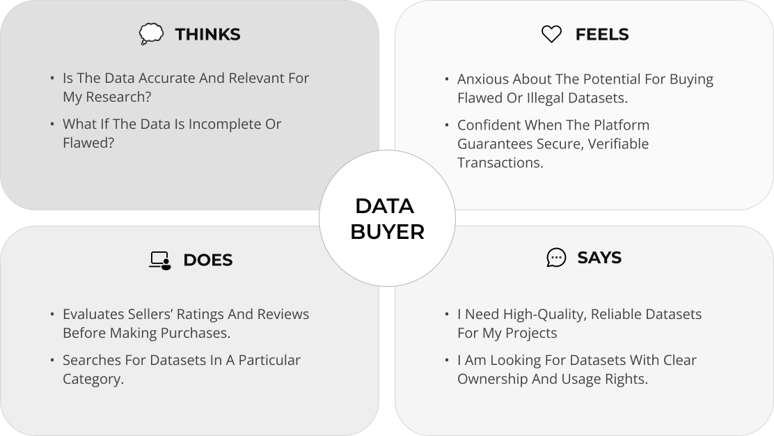
An Empathy Map helps us deeply understand our users their goals, frustrations, and behavior. For SecureXchange, it was crucial to map both Data Sellers and Data Buyers, since each has unique needs around trust, transparency, and value. This exercise guided me in designing a more human-centered, secure, and intuitive experience on the platform.
.png)
.png)
- Dark UI → Common in fintech/crypto, builds trust
- Data tables → Users need to compare datasets quickly
- Green accents → Signal "verified" and "secure"
SecureXchange was born from a simple idea: data should be shared with consent, value, and security. Designing this platform pushed me to think beyond UI into trust, transparency, and the future of decentralized systems.As the digital world evolves, SecureXchange could grow into a smarter ecosystem enabling permission-based collaborations, cross-chain compatibility, and greater data accessibility for innovation without compromise.